


Inflation I: The Good
Obviously, the outlook for inflation matters greatly to determining Fed policymaking and the course of the economy. Let’s have a closer look at the latest inflation data to identify the good, the bad, and the ugly:
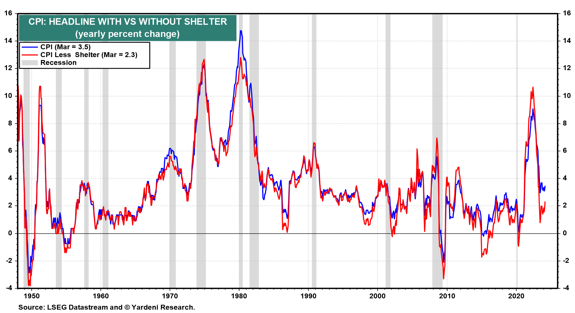
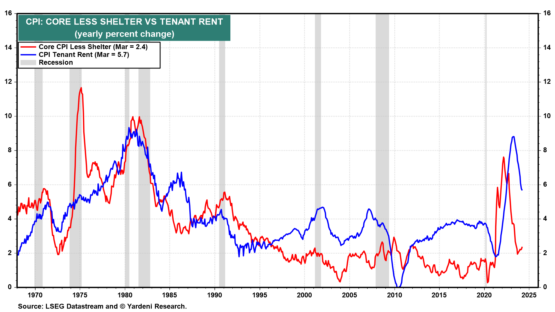
(1) CPI excluding shelter. Debbie and I are encouraged to see that the headline and core CPI inflation rates excluding shelter were only 2.3% y/y (versus 3.5% with shelter) and 2.4% (versus 3.8%) in March (Fig. 4 below and Fig. 5). Shelter inflation remains on a slow but steady moderating trend. It was down to 5.7% y/y in March from 8.3% a year ago (Fig. 6).
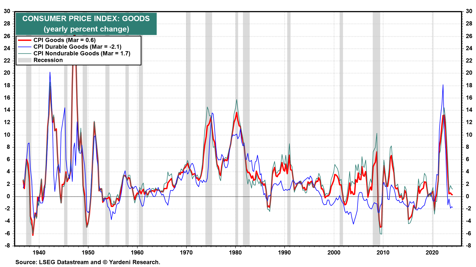
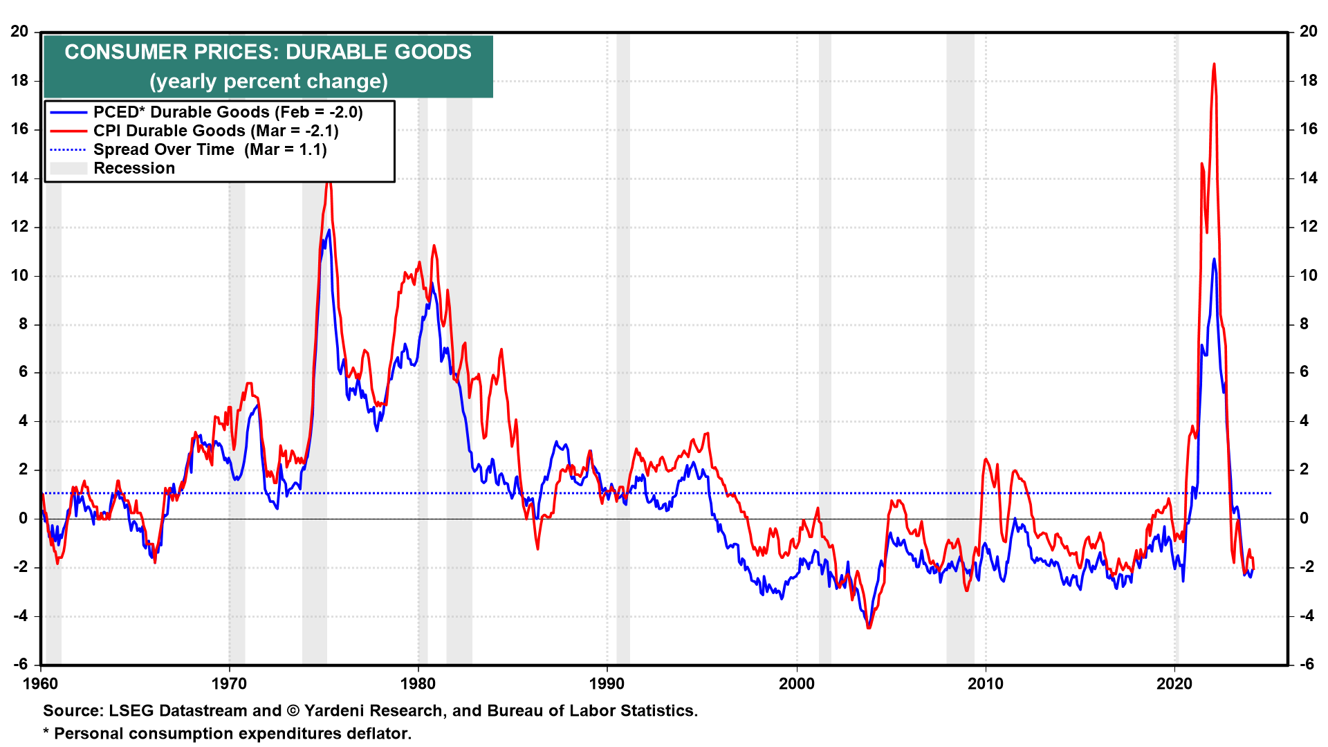
(2) CPI goods & import prices. Inflation remained subdued in both the CPI durable goods (-2.1%) and nondurable goods (1.7%) (Fig. 7 below). The former has been deflating on a y/y basis since December 2022.
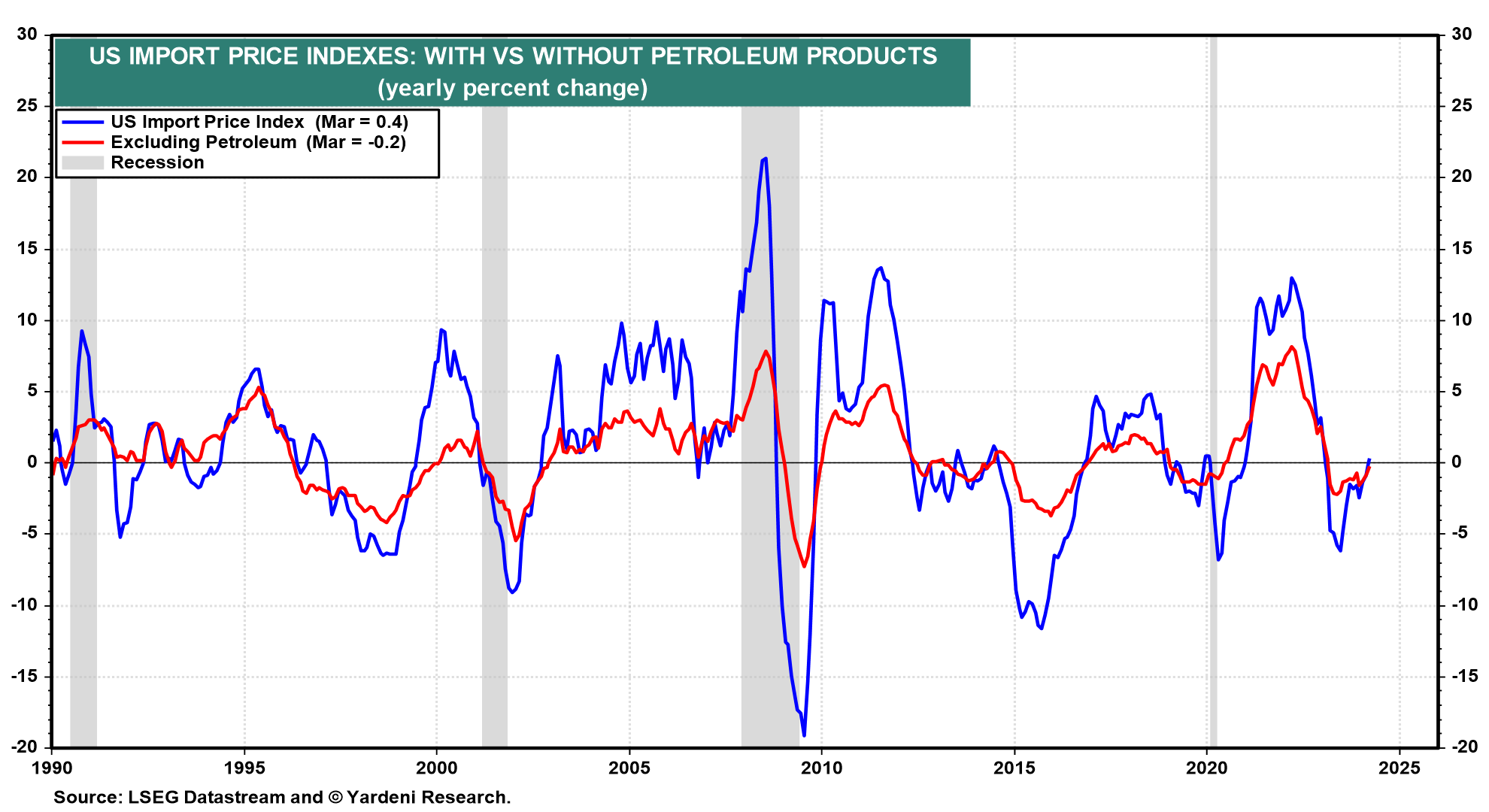
Helping to moderate CPI goods inflation are subdued import prices, which were up only 0.4% y/y in March and down 0.2% excluding petroleum (Fig. 8 below). More importantly, in our opinion, is that the price index for US imports from China fell 2.6% y/y during March, putting downward pressure on the US core CPI goods inflation (-0.6%) and US core PPI goods final demand (1.4%) (Fig. 9).
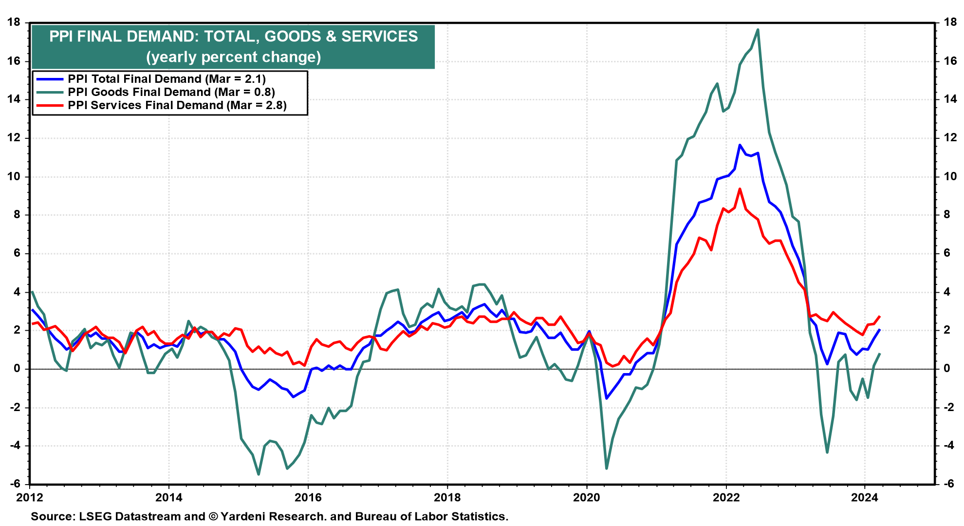
(3) PPI final demand. The PPI total final demand reflects the prices that producers and distributors of goods and services receive. It does not include rent, so its inflation rate tends to be similar to the headline CPI excluding shelter. The former has stalled over the past seven months, but in a very low range of roughly 0%-2% (Fig. 10 below). That’s where it hovered in the years prior to the pandemic!
(4) Expected inflation. Fed officials often say that they would like to see inflation expectations “well anchored.” That was not the case during the pandemic years through most of 2023 (Fig. 11 below). But so far this year, through April, the one-year-ahead expected inflation rate has hovered around 3.0%, according to the survey used to compile the Consumer Sentiment Index. That’s still above the Fed’s 2.0% target for actual inflation; but keep in mind that in the years prior to the pandemic, this series hovered mostly between 2.5% and 3.0%. So it has returned to its usual well anchored state, in our opinion.
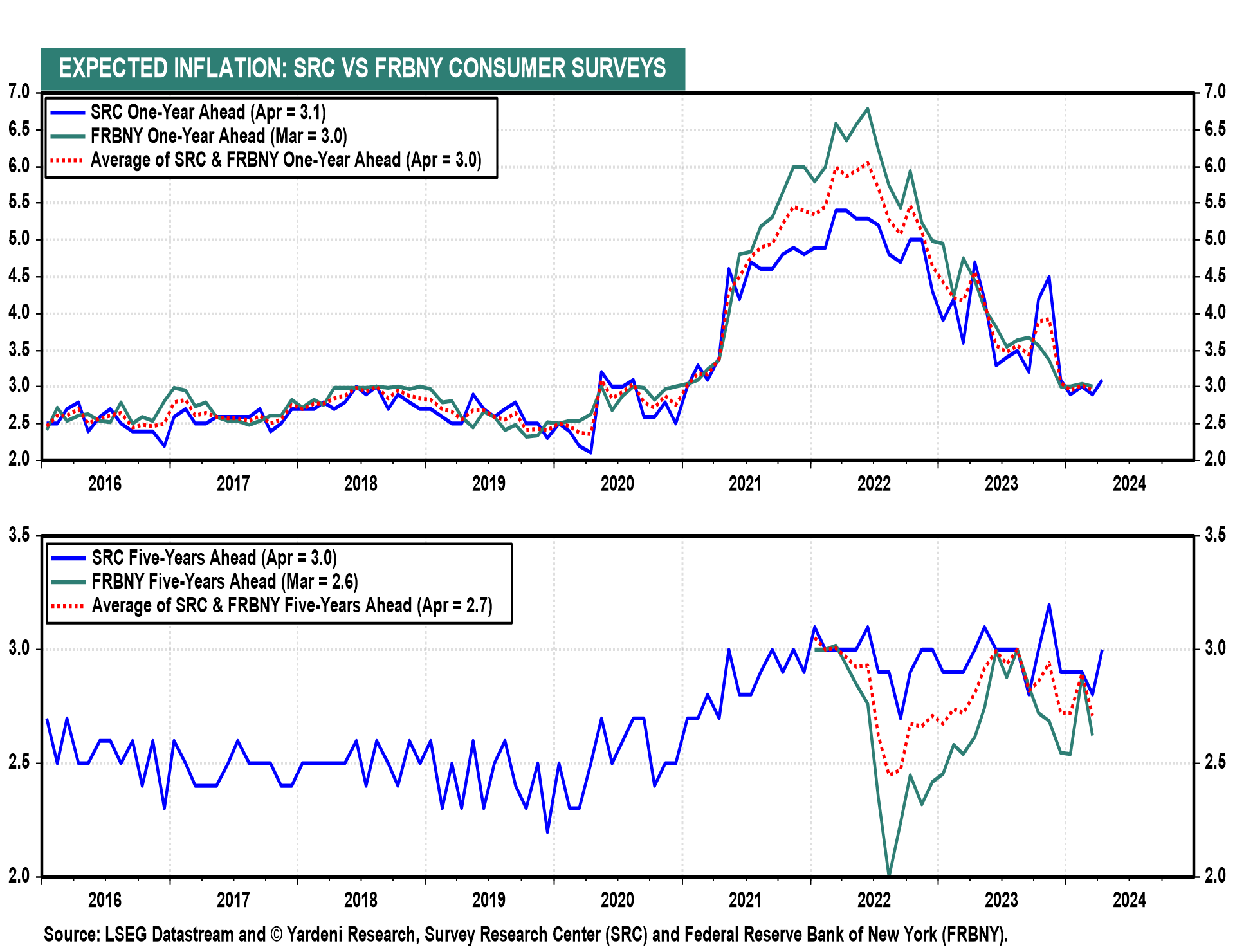
By the way, although consumers seem to be very aware that the prices they pay are much higher than before the pandemic, their assessment of the inflation rate has been surprisingly realistic. They aren’t confusing the higher prices they notice with the rate of inflation.
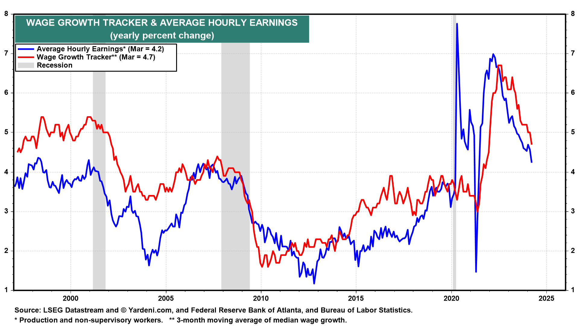
(5) Wage inflation. Despite last year’s big labor union settlements and the increase in the minimum wage, wage inflation continues to moderate. The Atlanta Fed’s Wage Growth Tracker is one of the wage inflation indicators closely monitored by Fed officials. It was released last week for March. It showed that wage inflation moderated to 4.7% y/y, the lowest reading since November 2021 (Fig. 12 below). Another more widely followed measure of wages is average hourly earnings. It was up 4.2% y/y during March, the lowest rate since June 2021 (Fig. 13).
Fed Chair Jerome Powell often has said that he would like to see these measures of wage inflation closer to 3.0% once consumer price inflation falls to the Fed’s 2.0% target. That clearly reflects an implicit assumption that productivity should grow around 1.0%.
(6) Unit labor cost inflation. Productivity rose 2.6% last year on a Q4/Q4 basis. That is certainly faster than Powell’s implicit assumption. That increase helped to offset a 5.1% increase in hourly compensation. As a result, unit labor costs (ULC) rose only 2.5% (Fig. 14). Both the headline CPI and PCED inflation rates closely track the ULC underlying inflation rate.
(7) CPI vs PCED. The CPI inflation rate tends to run hotter than the PCED inflation rate. Over the past 12 months through February, the spread between the two has been 0.7% for the headline (3.2% versus 2.5%) and 1.0% for the core (3.8% versus 2.8%) inflation rates. The average spread since 1960 has been 0.7% for the headline and 0.5% for the core (Fig. 15).
This divergence occurs for several reasons. Rent of shelter has weights of 36% in the CPI and 15% in the PCED. Rent inflation tends to exceed both the CPI and PCED excluding-rent inflation rates (Fig. 16 below).
Medical services inflation as measured in the CPI tends to exceed it as measured in the PCED (Fig. 17). The average spread over time since 1960 has been 0.7%. That’s because the CPI measures the out-of-pocket costs paid by consumers, while the PCED includes medical care services prices paid by government programs, which tend to be lower.
Finally, the CPI inflation rate for durable goods has tended to exceed that for the comparable PCED measure with the average difference over time since 1960 at 1.1% (Fig. 18 below). That might reflect that the latter incorporates more adjustments for hedonic improvements in the goods purchased than does the former.
Inflation II: The Bad
We have often observed that the overall inflation rate matters more than individual components for the purpose of monetary policymaking. For the Fed, the devil shouldn’t be in the details but in the overall headline and core inflation rates. We are clearly breaking our own rule here by getting even deeper into the weeds. There isn’t much the Fed can do about the current stand-out batch of inflationary items like rent, health care insurance, and auto-related costs. Currently, those are the peskiest problems for inflation: